

20 UX mistakes to avoid in your website
UX is important in all digital products. Over time, the attention span of users have decreased, and by research is currently standing at 8 seconds.
If you want your users to stay on your website, you need to give them a reason to:
- the website loads fast (1 sec)
Google mentions if you want to be considered a good website speed, it has to completely load under 2 seconds. To all software engineers out there, this is an exciting standard you want to consider pegging yourself.
In this article today, we will be talking the mistakes to avoid so you can create a good UX experience. UX consists of 2 of the 7 qualities of a great website.
- ** Well designed and Functional **
- Easy to Use
- Optimized for Mobile
- Fresh, Quality Content
- Readily accesible contact and location
- Clear calls to action
- Optomized for Search and the Social Web
- Autoplay of audio/video
Generally you want your website to have short and easy to understand audio/videos of your website’s intent. Yes, the internet space has been shaped by tiktok’s video structure.
- Misuse of breaking news
 A good example of using news content on a website. Designed by Earthr.
- Unstructured web forms
Forms are easy, they shoudlnt confuse people, so spending time to personalize your form for the context at hand, it will go a long way.
 Personalization is key. Designed by Alex Banaga
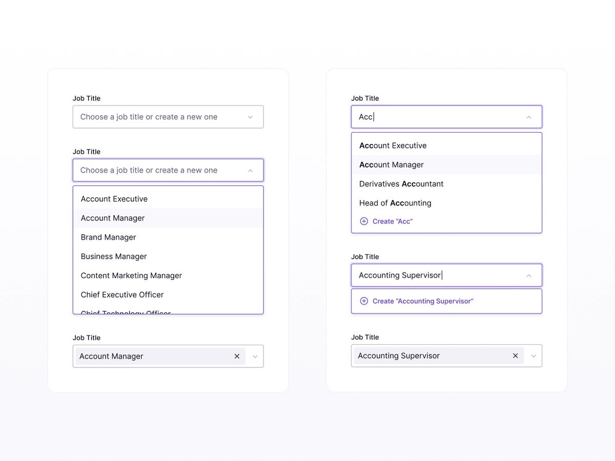
- Long dropdowns
If you have a long list of items for users to choose from, allow them to type to filter down. Please do not make them scroll for the next 5-10seconds, they will thank you for it.
 Long dropdowns can be the shortest way to ruin UX, Source: medium
- Violation of the 3 click rule
Please check the number of clicks a user is required to complete the desired action. Any desired action should be reachable within 3 clicks. Please do not make your users jump through hoops. Taking a step back, if the user is to join a wait list, let them join a wait list with a click of a button.
 Source: Lyleads
- Checklist with a large number of options
Just take note on to make it too lengthy unless the context requires of it.
 Source: medium
- Plenty of tooltip
If your interface requires such detailed explanation, perhaps a rehash of your copywriting could do a little more work. This UX is subjective based on the context also. In a techincal product where terms used are technical and specific to context, a little tooltip can help.
 Analyze the user’s needs. Designed by Craftwork
#9. Annoying Color Schme
Getting the color scheme right is important. Choose something brighter for attention, avoid red unless you want to create a sense of urgency/emergency.
#10. Complex Password Requirements
Passwords should be secure, but too complex. you will find yourself deterring users. Ideally passwords should only be used if necessary. Otherwise, you will probably be creating a not-so-secretive website in which you can utilize google/linkedin social logins.

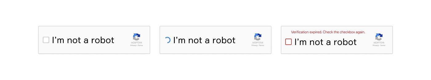
#11. CAPTCHA overuse
CAPTCHA is important to avoid random robots landing on your side.
If you want users to love your UX, do not put sand in the wheels, allow users to reach whatever content they wish to reach as easily as possible.
#12. Incorrect use of demo content
Only show them the free demo content where it matters.

#13. Lack of Intuitiveness
You have to make it easy for the user’s eyes to follow. Typically, a user’s eye path follows a F formation from the top left down.
- Specific Jargons
please ensure the copywriting of the website is suitable for your targeted audience. Interestingly, you don’t need to write it simple for the everyday person. Perhaps the everyday person is not your target audience. When you use sufficient technical terms, you will attract the the right people.
- Empty spaces
Even when the internet is off, google uses that space on the browser, you can do that too.

- Authentication Issues
As easy to sign up. Its related to #10. Keep it easy especially if your website is not all that data heavy.
- Overusing words
Make it easy for someone to understand what you are doing. More infographics, words less than 2 sentences.
If you cannot keep your value prop short, perhaps you do not know your product well enough.
A tip i usually give: use existing tools as references. Example: Netflix for career (a site that holds video content specifically for career)
Property guru for tuition centres.
- unneeded messages
Keep your copywriting to the minimal. If the UI

- Lack of recommendation on what is next
Your CTA has to be clear and concise. You are sharing information for some reason. Indicate that reason and action on your site.
- Load delay
Do not take too long to load. If your website needs that long to load, you need to get that sorted out as part of the few qualities to a great website.

TLDR;
Set up your website for the right audience. As an engineer, you shouldnt’ just be putting in content just because your clients ask for it. Putting in a little more thought in the development process can increase the value add you provide to your customers.
Collating these best practices can help you to be a more effective engineer over time.